
We’re a photography led brand. Icons can help quickly indicate to our audiences and users what we’re trying to get across or send them quickly. An example of this in practice on our website is our ‘about Aegon UK’ web page. Our illustration style should only be used on the website where photography wouldn’t adequately communicate our messaging. Illustrations can play a bigger part in pieces like animations, videos or infographics.
1. Photography
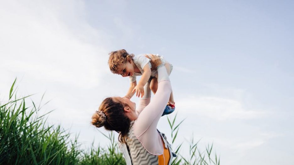

Photography is the primary element of our brand. We use humanist photography that covers every aspect of life – showing how people are really living, working and feeling today. It breathes life into our communications, encompasses the essence of our brand and highlights our focus on the audiences we help and support.
As well as using coloured photography, we can use black and white options to convey different emotions. It’s also a nice way to approach more sensitive situations.
We typically lead with aspirational lifestyle photography. This is because it evoked a strong emotional connection compared to corporate photography when we tested different styles with consumers and employers.
Photography checklist
When choosing photography for a page, here are some key points to keep in mind:
- The journey – consider where the page fits into a wider customer journey and what photography has already been used. Avoid re-using photography that featured on the previous page of the journey.
- Format – if placing photography in a shape, does the photo get cut off? Does the subject face the text to help draw the audience attention?
- Colour – do the colours of the photo match the background colour of the asset? Or is contrast needed instead? Would a black and white image work better?
- Messaging – are the mood and the activities appropriate for the copy? Watch out for photography that is too literal.
- Diversity – have you got a range of people included across the whole asset you’re working on? Consider age, ethnicity, gender, religion, disabilities, for example.
Where you can find our photography
Photography for web pages can be found in the following folder within AEM:
- Assets(DAM)>AegonUK>Assets>Images>Photography>Rebrand
Important note: the rebrand folder currently sits within the old brand photography folder. Please only choose images from the rebrand folder.
2. Shapes
Our shapes are a distinctive and unique element that helps us stand out from our competitors. They frame our audiences’ day-to-day moments and the big picture of their ambitions. They represent the different stages of life and allow us to tell stories.
Using shapes on AEM
The use of shapes on web pages is being updated gradually. At the moment the following components allow for shapes to be added:
- Promo panel image single link
- Promo panel guide multi-link
- Hero banners
Shape usage examples and guidelines
Below are a few example panels using different shapes, images and colour. The first two feature good examples, while the third is an example of an image and shape that wouldn't work well together.
Please note:
- Coloured promo panels should not be positioned right next to each other. These are for example purposes only.
- Try to stick to only 2 to 3 colours per page, spread out across the page.
- Note that for hero banners, the image should always be on the right hand side


3. Icons
Our icons are essential for clear and effective communication. They’re particularly effective to highlight key pieces of information and should be used to help people navigate content, as shown in the examples below.
4. Infographics and Illustrations
Infographics or illustrations should be used sparingly, and only when photography or icons cannot sufficiently communicate the information. If required, submit a creative brief on MOS. APS and Brand will then review and advise the best approach.
Infographics should be a .SVG file, this means that it will be in a scalable format. You may also want to consider a separate mobile version with different proportions as font size could be unreadable when scaled down from desktop.
5. Image Accessibility
- Make sure that alternative (alt) text has been used and accurately reflects the purpose of the image or provides an accurate description. If the image is linked, describe the link destination in the alt text.
- Be careful when using images with text in them. Be sure image alt text communicates the same information as the text in the image.
- When using graphs or diagrams, include accompanying text to explain the meaning.
- For infographics or complex images with a large amount of text, its best to include a short description in alt text and a long description in adjacent text.
When images are broken on the website, alt text is also used to provide context – as seen in this example to the right of this text.