
On this page you'll find more information about:
Our brand look and feel
A strong brand is consistent at every touch point you experience it. Our core brand elements have all been designed to blend effortlessly – forming our look and feel.
The starting point when creating any communication should be the use of our logo, colour palette, photography and shapes. These are all used to represent our brand in a powerful way – creating a clear sense of identity around who we are as an organisation and what we stand for. They also ensure that our digital estate is in line with our purpose of helping our customers live their best lives.
To find out more about our look and feel, you should read and refer to our launch pack – the shape of things to come. You can find this on our brand intranet hub which also features our tone of voice guidelines and brand templates.
Our brand is managed by the Brand and Content team. If you have any questions or would like more information, please reach out to Lauren Buchanan, Victoria Baird and Kirsten Kinloch.

Digital typography
Digital typography not only focuses on aesthetic considerations but also addresses readability, accessibility and responsiveness for various screen sizes. Font type, size, weight, colour and line height should be carefully selected and balanced to ensure an optimum, accessible user experience.
We use two different fonts in different contexts:
- Our default system generated font for use in Microsoft Office (such as when creating presentations and word documents) is Arial.
- Our brand font is Forever Forma – all assets from APS will be created using this font.
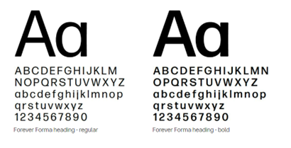
Forever Forma
Forever Forma is functional, expressive and warm. It’s been especially designed for us, based on the existing Forma font. Our Forever Forma is unique due to its simplicity and strong, recognisable character. Some letter shapes are altered, like the openness of the ‘g’ and ‘e’, and the tail of the ‘j’. The weights are made just for us, and the numbers are also altered.
Forever Forma heading comes in two weights: regular and bold. We mostly use the regular version for headings, while the bold version is for extra emphasis in case it is needed.
One of the most differentiating aspects is the tight letter spacing. This makes Forever Forma quite sensitive to size – when tight spacing is used in small font heights, text becomes hard to read. That is why there are different versions for headings and body copy.
All of our text is generally placed in Warm Black or regular black on a light background, or in white on a dark background. We use Warm Black for headings and body copy wherever possible, with the exception of MS Office templates.
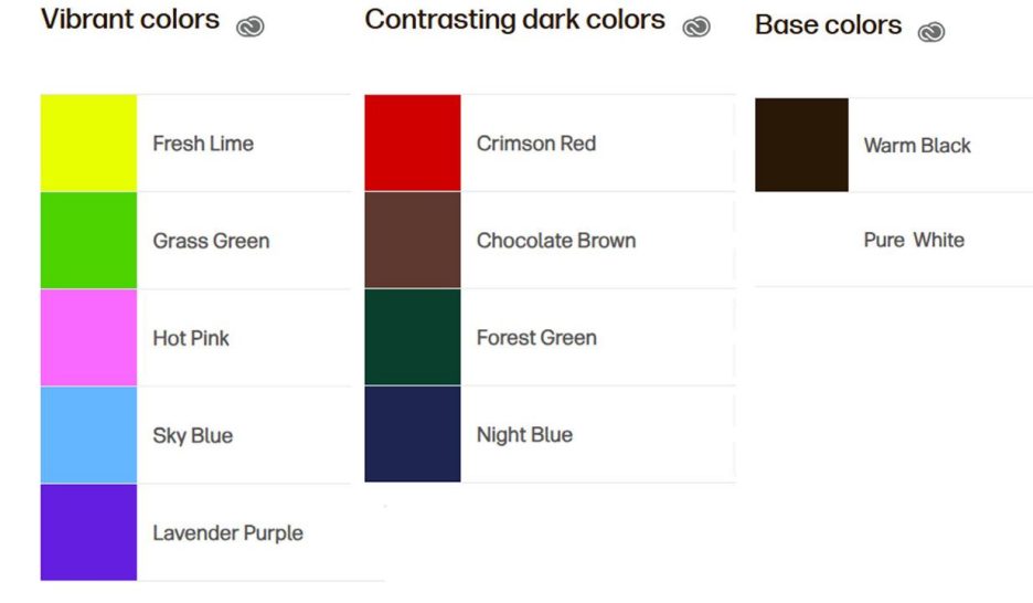
Digital colour palette
Colour can evoke a powerful emotional response, with different colours conveying different emotions in people. Our colour palette reflects who we are.
Our colours are vibrant and contrasting to stand out from the conservative approach of our competitors. They represent optimism and allow us to connect with our audience in the various phases of their longer lives.
Our palette expresses the happy moments in life through vibrant colours, and the more serene or serious issues, through darker and muted colours. It also allows us to connect with a broader audience, particularly younger people and women.
We use colour to make a big visual statement, set the mood or just be supportive. We always apply colour deliberately and carefully to make sure that the composition is balanced.
Some best practice principles to keep in mind:
- Make sure to use our full colour palette as we don’t have a lead brand colour.
- All of our colours are open for every use – we don't use our colours to code products, business units, or audiences.
- Apply our colour palette in a control and measured way – try to stick to using only 2 to 3 colours per page.
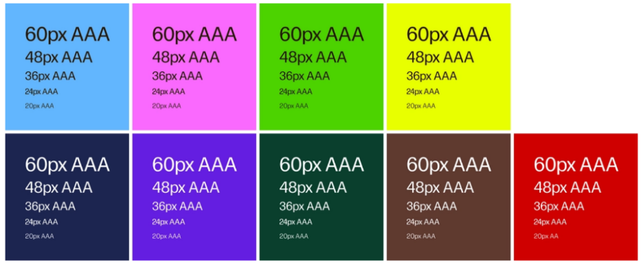
Colour accessibility
We keep accessibility and legibility in mind when combining text and colours.
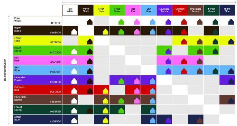
Shape on colour matrix
These are the allowed combinations of shapes on colour. It’s a deliberate selection to maintain our preferred brand look and feel, and keeping in mind accessibility too. Stick to the branded templates provided as they have the correct combinations applied.
Text and colour
We now use warm black instead of regular black as it’s better for readability and accessibility. We continue to use regular black for Microsoft Office templates.
It’s crucial to adhere to accessibility standard when we place text on a coloured background. The text colour combinations are tested and approved according to the international accessibility guidelines WCAG 2.1 level AA(A).